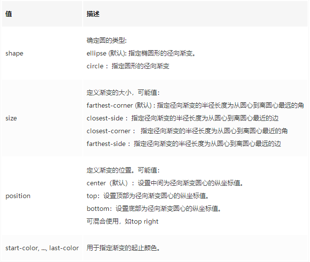
radial-gradient(shape size at position, start-color, …, last-color)
1
2
3
4
5
6
7
8
9
10
11
12
13
<style> .coupon{ width: 200px; height: 80px; background: radial-gradient(circle at right bottom, transparent 10px, #ffffff 0) top right / 50% 40px no-repeat, radial-gradient(circle at left bottom, transparent 10px, #ffffff 0) top left / 50% 40px no-repeat, radial-gradient(circle at right top, transparent 10px, #ffffff 0) bottom right / 50% 40px no-repeat, radial-gradient(circle at left top, transparent 10px, #ffffff 0) bottom left / 50% 40px no-repeat; filter: drop-shadow(3px 3px 3px #c5c5c5); } </style>